Making Home-ownership More Accessible
Project type: MVP Design for an existing compagny.
Role: UI Designer and Researcher
Team members: Tiana Beaulieu, Ana Formentunovic and Daniel Salim
Tools: Figma, Figjam, Zoom
Duration: 6 weeks
Context
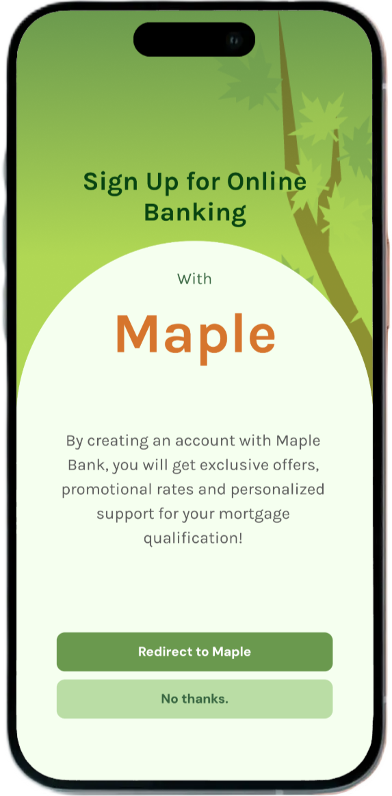
Bloom is mobile app for a canadian neo-bank, Maple Bank, and is designed to support first-time homebuyers—especially younger adults—through the mortgage process.

62% of canadians aged 18 to 28 believe homeownership is unachievable

Real Estate represents 55% of overall household wealth for Canadian families.

44% of canadians aged 18 to 36 have not taken steps to strenghten their financial knowledge
Digging Into the Problem
Research showed that many young adults face barriers like complex financial jargon, unclear guidance, and lack of personalized tools, which create uncertainty and discourage them from pursuing homeownership.
Bloom aim to alleviate the uncertainty and complexity of purchasing a home by providing a simple, educational, and supportive mobile app that guides users step-by-step through the mortgage journey
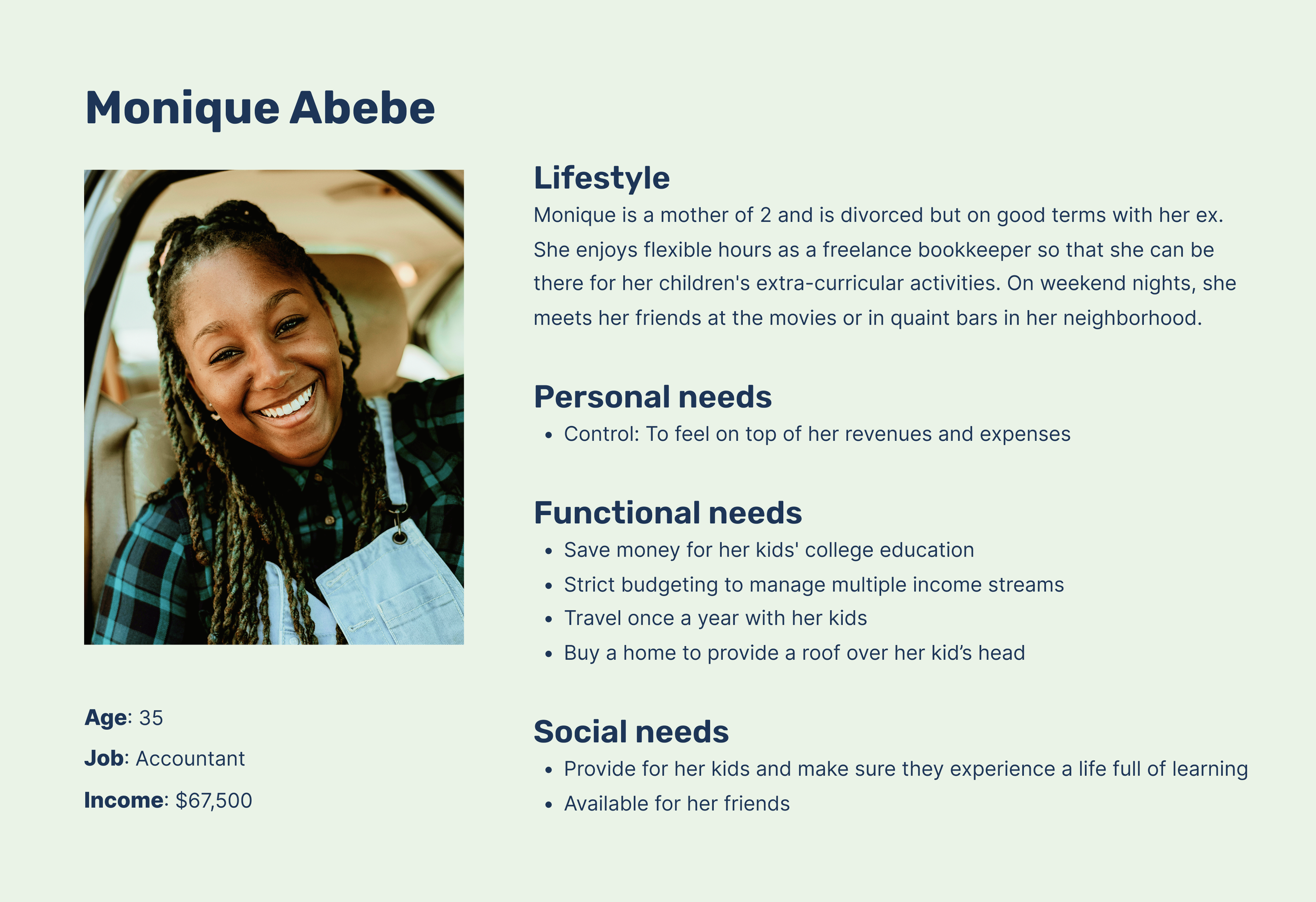
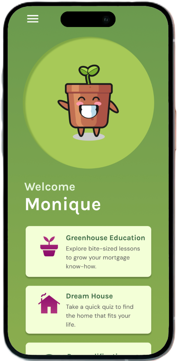
Design decisions were guided by our persona, Monique, whose needs for financial control, flexibility, and work-life balance as a single working parent kept the team focused on creating user-centered solutions.
Roles
I played a key role in doing the initial research and visual design. Other team members focused on onboarding, business alignment and educational design.
We shared responsibilities in usability testing, co-creating scripts, running test sessions, and synthesizing findings. Our collaboration emphasized continuous iteration and strong alignment with both user needs and business goals.
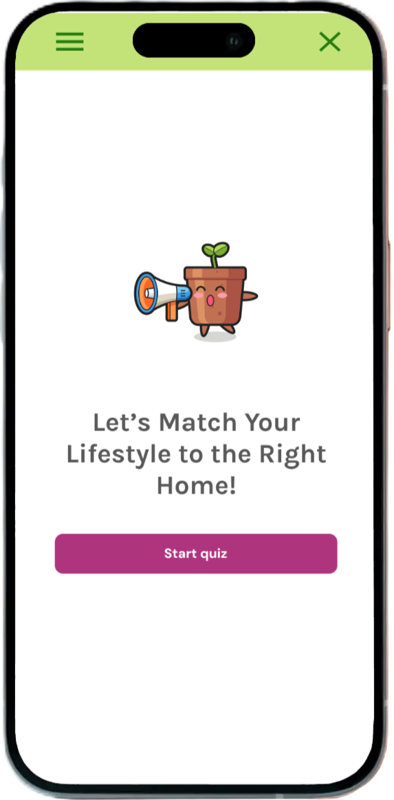


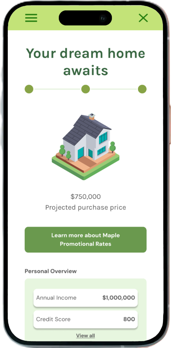
Key frames of the final dream house flow. I designed it to guide users through a personalized journey to match their lifestyle, financial goals, and family needs with the right home options.
How might we inspire young people to consider home-ownership?
Designing with Purpose
Using the key elements of a successful onboarding experience, we designed features that allow users to learn about, understand, and fulfill a mortgage application.
The first iteration introduced key functionalities:
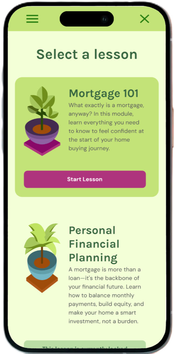
A modular learning path broken into short, actionable steps
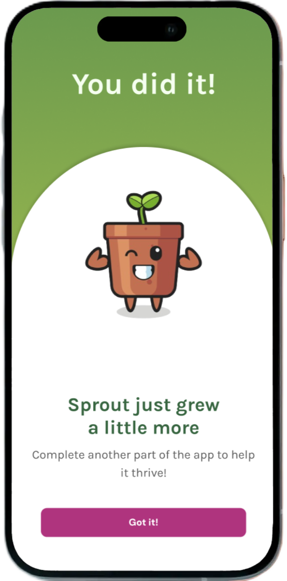
A friendly digital companion named Sprout, offering encouragement and clarity
Tools to estimate affordability based on lifestyle and spending habits, rather than just income
A progress tracker to help users visualize their journey toward pre-qualification.

Putting It to the Test
We tested medium fidelity wireframes. In user testing, participants responded positively to the clarity of the flow and the approachable tone. They especially appreciated Sprout’s role in making the process feel less intimidating. However, the testing also surfaced areas for improvement. Users wanted more control over how much information they received at once, clearer guidance on what to expect in later stages, and stronger visual cues to help them navigate between steps. These insights informed the next iteration, which included more flexible navigation, enhanced visual hierarchy, and better customization of learning content on user goals.
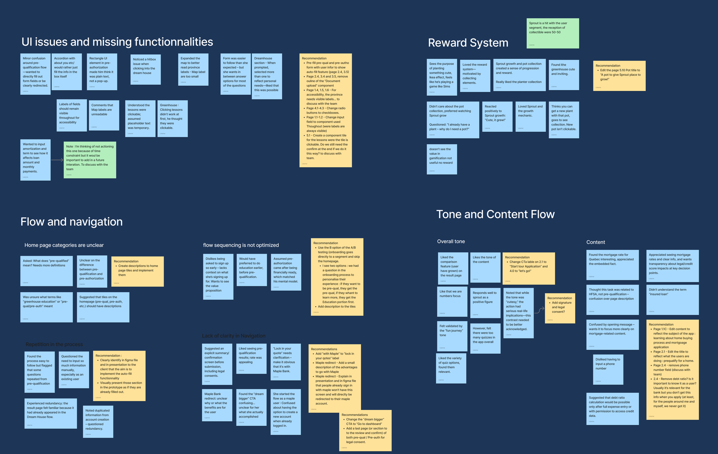
The affinity map helped us organize user insights into clear themes, which we used to identify key pain points and prioritize features that addressed users’ financial uncertainty and lifestyle needs.
What Came Out of It
To address the issues we uncovered in user testing, I made several key improvements to Bloom’s design. These updates helped create a smoother, more supportive experience—one that better met the emotional and practical needs of first-time homebuyers. Here some of them:
Navigation
First, I focused on improving the navigation and flow. I gave users more control by allowing them to move back and forth through the content at their own pace. This helped reduce the sense of being stuck in a rigid sequence and gave people more flexibility, especially those who already had some knowledge of the process.
Improving Clarity
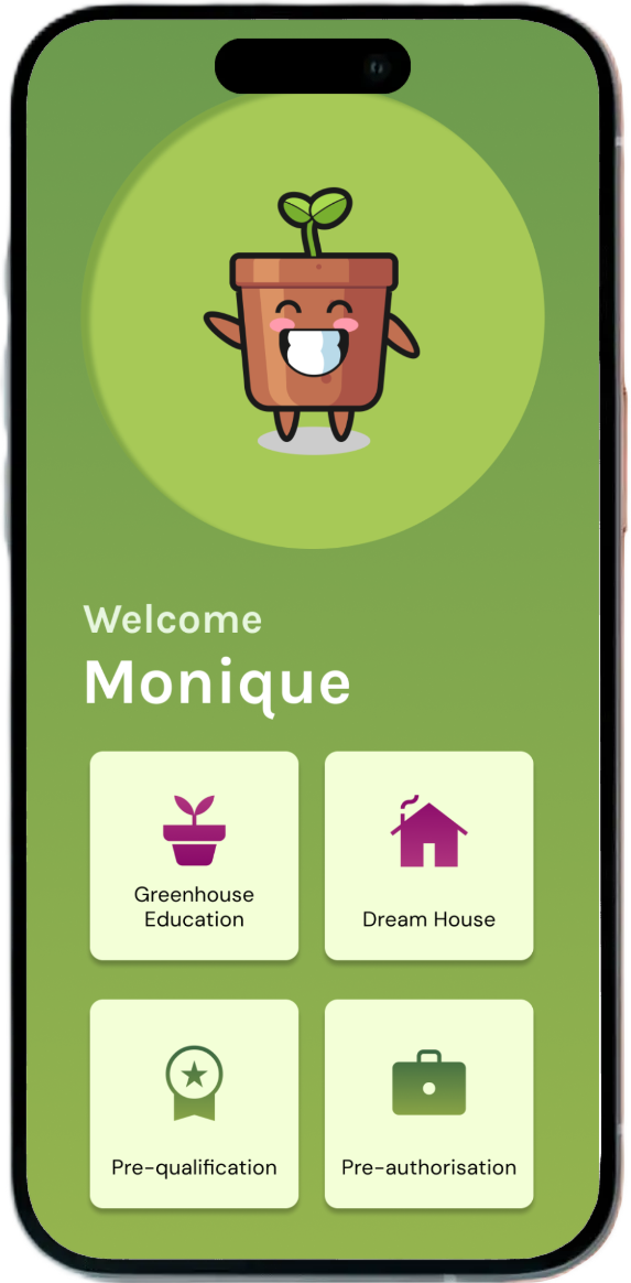
I also redesigned the homepage, adding short, descriptive labels to each tile to give users a clearer sense of what to expect from each section.


Lessons Learned
Working on Bloom challenged me to design for one of life’s most intimidating milestones: buying a first home. I had to learn to translate dense financial systems into something approachable, empowering, and even enjoyable.
Designing with Sprout pushed me to think beyond function and into emotional connection: how might we make users feel supported, not just informed? And in Bloom’s case, that meant turning a daunting financial journey into something that feels possible, personal, and even a little joyful.
Sprout was designed by Heri Detuamas.