
Designing for Affordable, Proud Home Cooking
Project type: New feature and mobile app design
Role: UI Designer
Team members: Tiana Beaulieu, Ana Formentunovic and Daniel Salim
Tools: Figma, Figjam, Zoom
Duration: 8 weeks
Context
Freshly Chopped is a recipe and grocery delivery app that supports Canadians in making affordable, home-cooked meals. Our task was to add seamless ingredient ordering functionality, making delivery the primary call to action—without losing the option for users to generate their own grocery lists.
My responsibilities included supporting usability testing, co-leading research synthesis, and refine the design for the saved recipe, shopping cart and recipe upload flows.
Digging Into the Problem
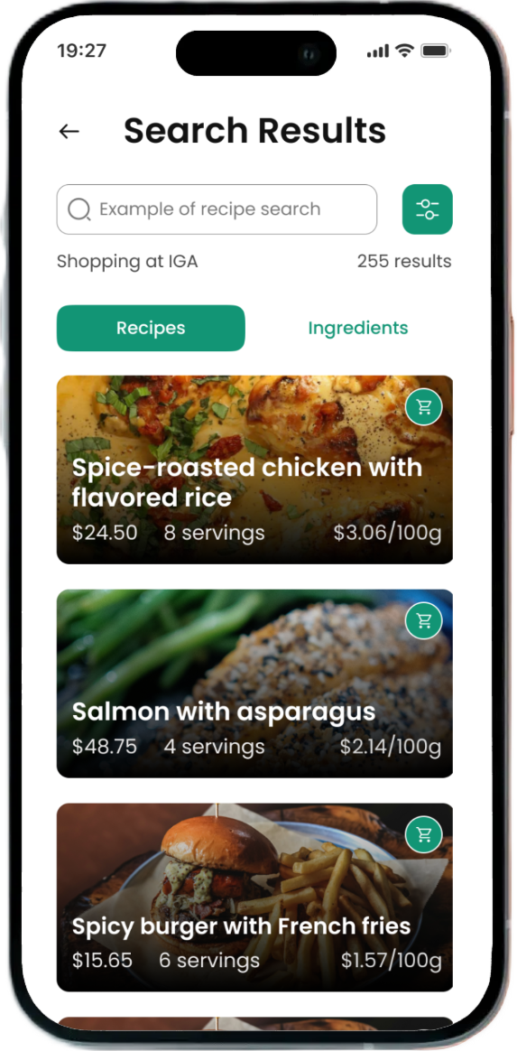
The original Freshly Chopped app offered a strong recipe browsing experience but lacked any way for users to act on their inspiration. Users couldn’t order ingredients, customize their selections, or even create a practical grocery list. Existing social features were hidden and unclear, limiting community engagement.
There were also multiple accessibility issues, notably small font size and color contrast.
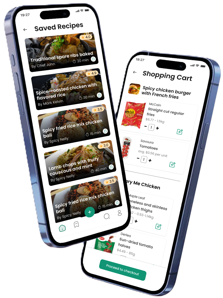
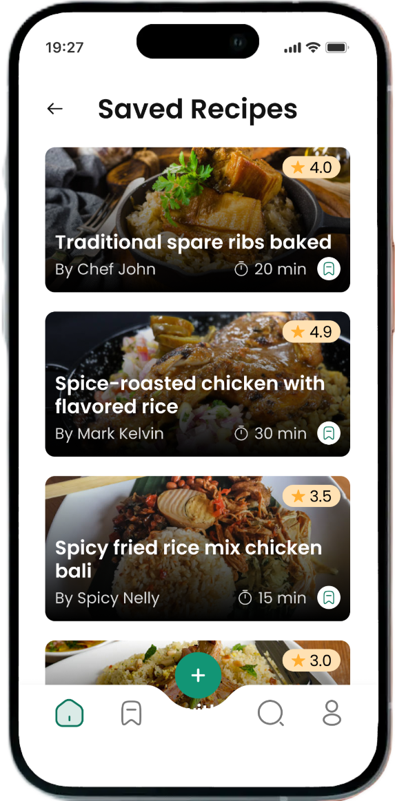
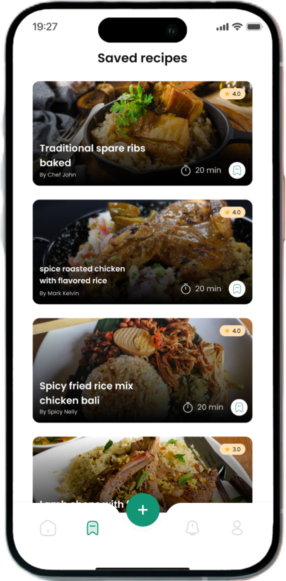
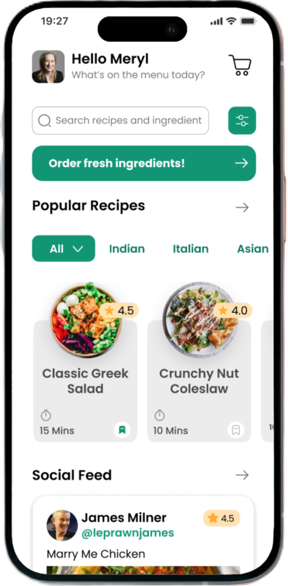
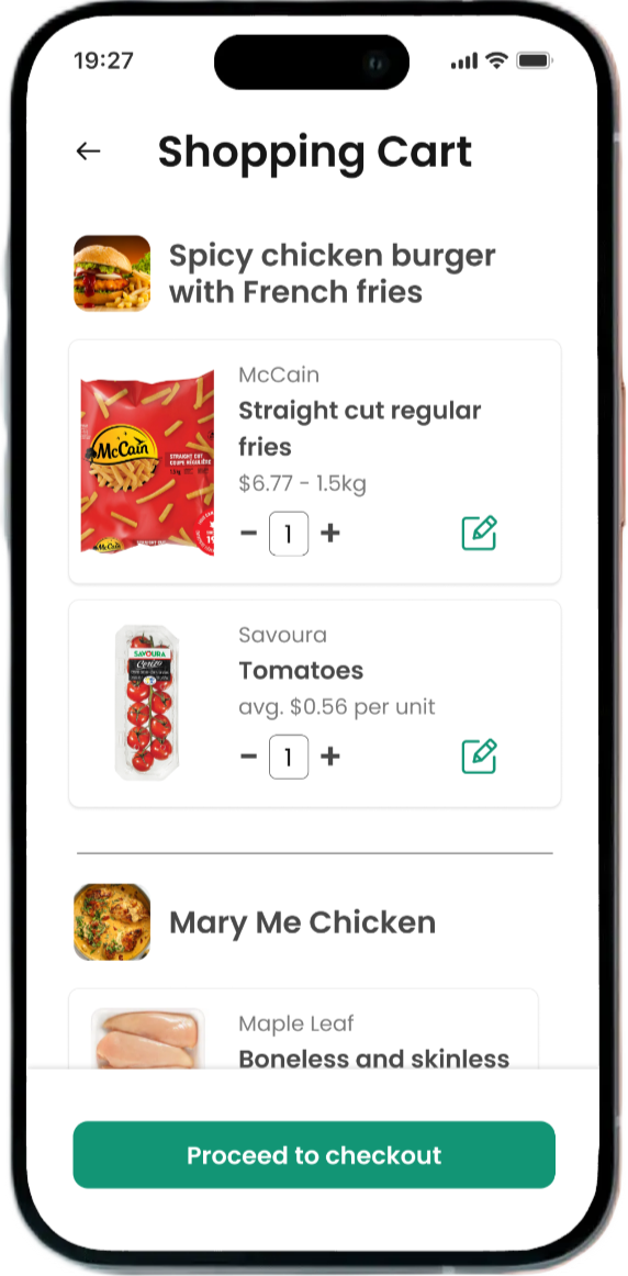
Users can save recipes and easily add their ingredients to a shopping cart for quick checkout in the Freshly Chopped app.
Designing with Purpose
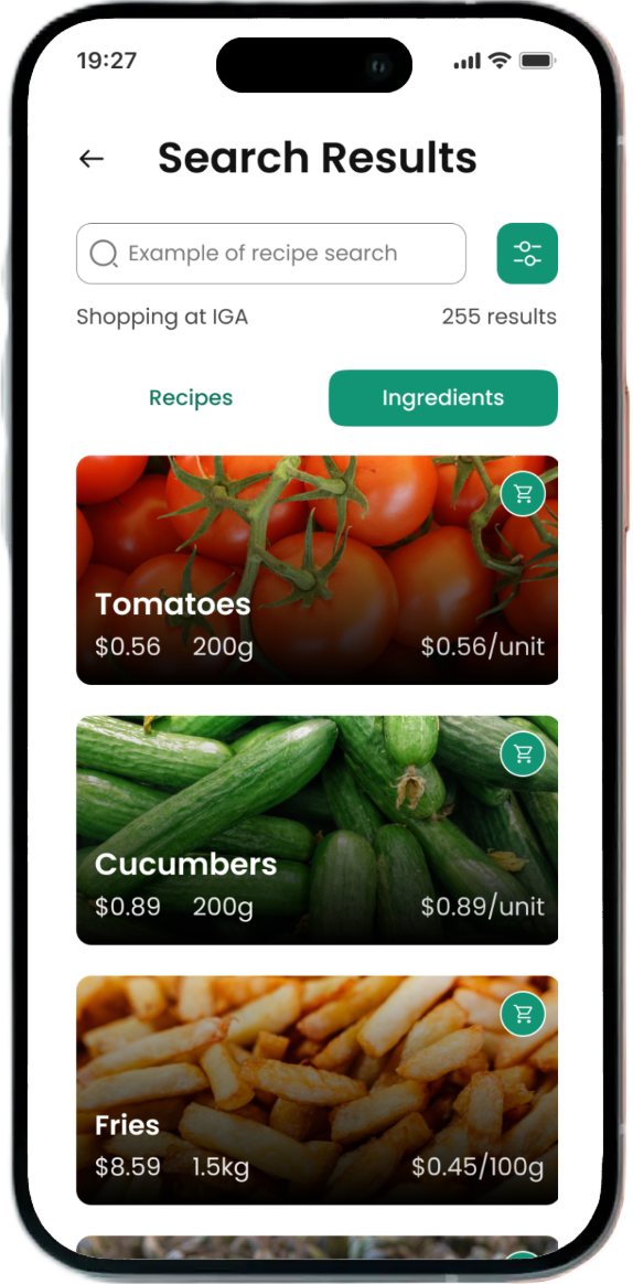
We redesigned the app’s structure, prioritizing clearer navigation and introducing new functionalities like a shopping cart system with recipe integration and automated item selection based on budget. We also enhanced visual elements to bring social features to the forefront.
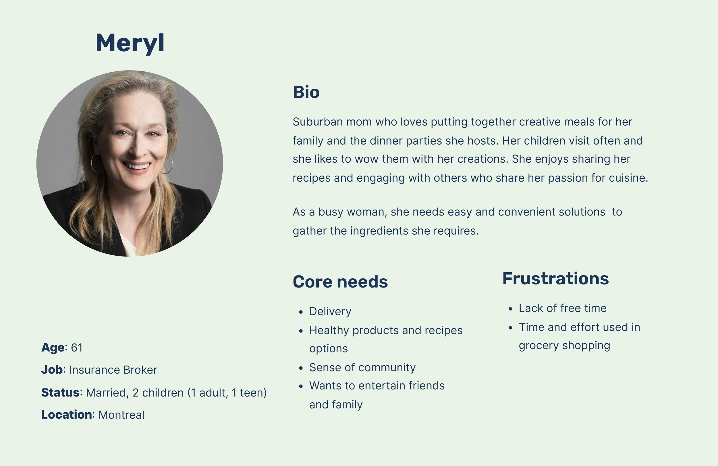
Our design centred around Meryl, a suburban mom with a big family, a limited budget, and a love for impressive meals.


Accessibility fixes
Key issues included low color contrast and small font size. I addressed these by updating the color palette for better contrast and fixed the font size . I also restructured navigation to be more predictable and consistent, reducing cognitive load for users with disabilities. These changes helped make the app more usable for everyone.
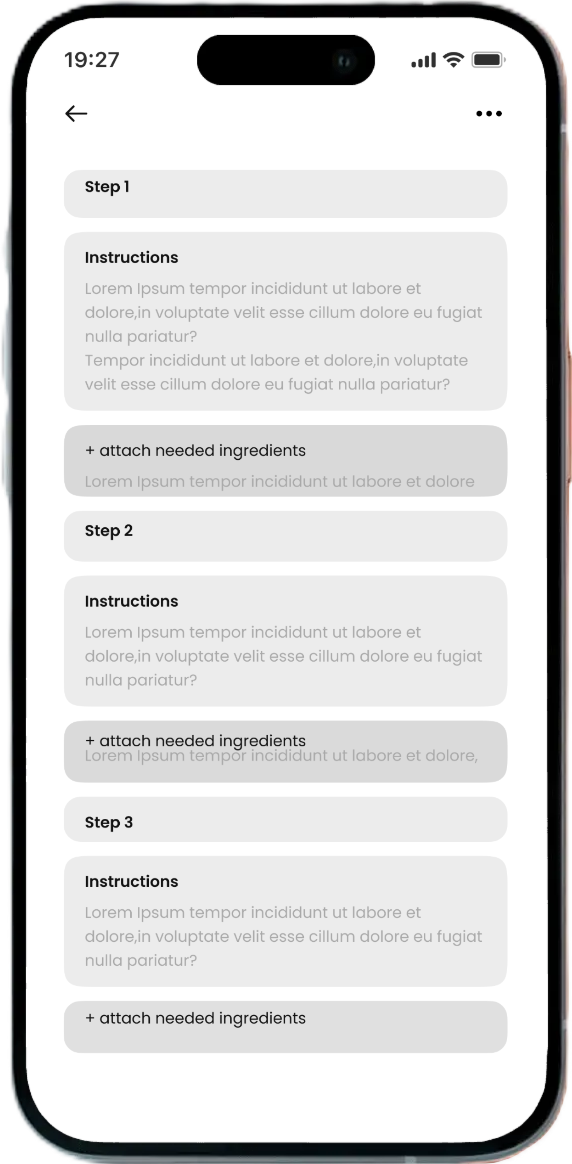
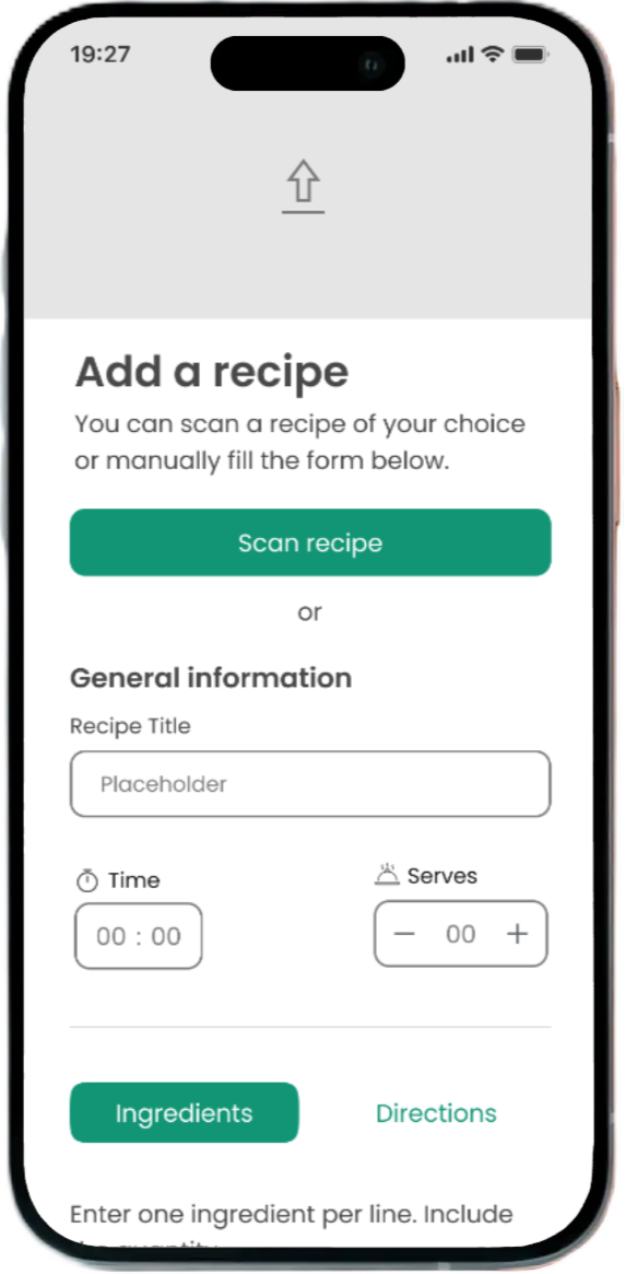
Recipe Upload
Based on our user testing, I improved the recipe upload feature by simplifying the flow, adding clear step-by-step instructions, and including input examples, making it easier for users to understand the format and confidently share their own recipes.
Putting It to the Test
In user testing, we uncovered several important insights, notably:
the new shopping list was often confused with the shopping cart, causing some navigation issues
the recipe upload feature was unclear to many users, who struggled with the format, highlighting the need for clearer guidance and improved usability in that area.
What Came Out of It
We streamlined Freshly Chopped by removing the confusing shopping list and focusing on a clear, customizable cart linked to both recipes and grocery searches.
The design system provided by the client had accessibility issue. I finalised the accessibility fixes by refining the button contrast and font sizes. Lastly, I enhanced the recipe upload with clearer steps and a scan-to-import feature.

Lessons Learned
Working on Freshly Chopped challenged me to balance user needs with business goals in a fast-paced, iterative environment. From uncovering usability issues through testing to refining key flows like recipe upload and grocery selection, I honed my ability to translate research into actionable design improvements.