Simplifying Health Claims for Public Servant
Project type: Exploratory research and concept design
Role: Sole UI/UX Designer
Tools: Figma, Figjam, Zoom
Duration: 5 weeks
Context
When Canada Life took over the Public Service Health Care Plan in 2023, over 300k public servants—started relying on its mobile app to submit health claims. But for many, the experience wasn’t working the way they needed it to.
Initial explorations & research
I started with a usability audit and an environmental scan. Here’s key insight:
The app has the longest claim submission process compared to its competitors, partly due to extra steps like entering service details and uploading receipts.
The progress bar is misleading, making the process seem longer than it actually is.
Navigation is often confusing—for example, users must go through multiple clicks to view processed claims, and key sections like the Benefits page have a clunky information architecture with loops and dead ends.
Inconsistent use of the phone's back button and unclear icons (like the virtual insurance card) further disrupt the flow.
Additionally, labels and lists lack intuitive organization—the claim types aren’t in any logical order, and the “search a provider” feature is actually a redirecting button, not a searchable field.
Overall, while the app includes helpful features, they are undermined by navigational friction, poor information hierarchy, and inconsistent interactions
I compared Médic Construction and Beneva to Canada Life to identify usability gaps, revealing that competitors offered clearer, more intuitive claims experiences and better mobile support.
Digging Into the Problem
I spoke with users directly and discovered their top frustrations :
Repetitive information entry: Several users pointed out that they were asked to enter the same information multiple times throughout the process. This duplication made the experience feel inefficient
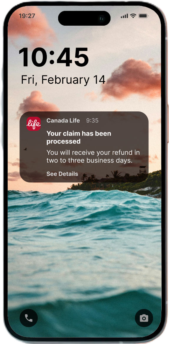
Lack of meaningful communication: Users were frustrated by generic emails stating that a claim had been processed, without any details.
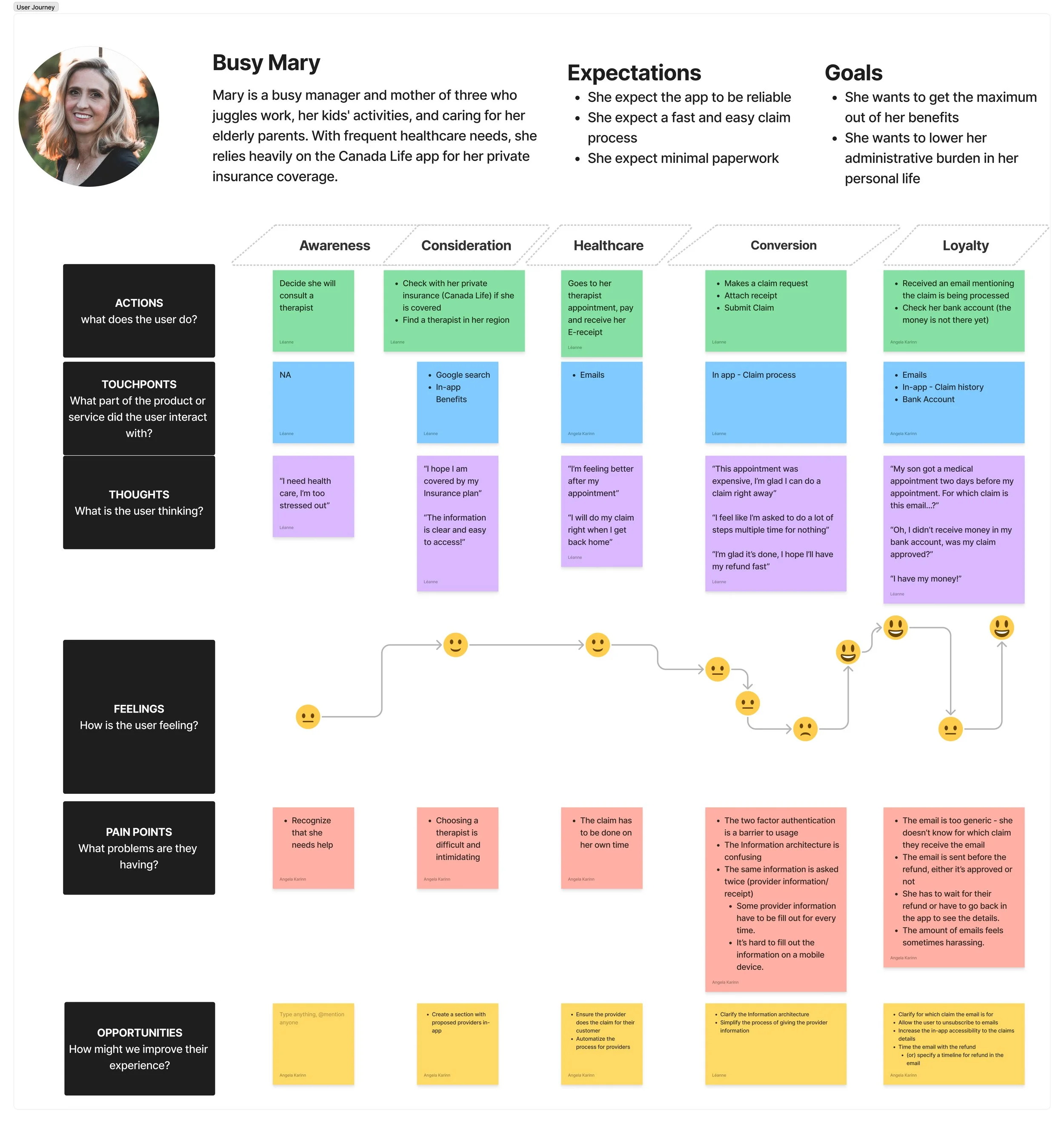
Mary feel overwhelmed by the complexity and time-consuming nature of the claims process, revealing a need for clearer communication, simpler flows, and more tailored support throughout their healthcare journey.
How might we optimize the claim process for current users?
By simplyfing the process: User research found that most users wanted to feel in control of the process but didn’t want to deal with the administrative part of it.
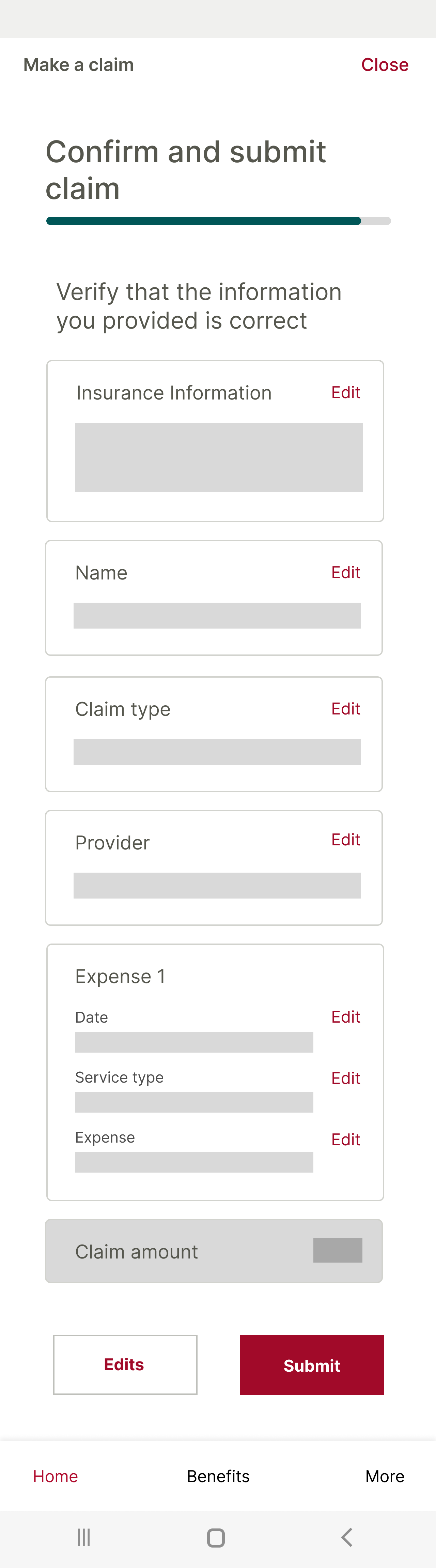
The proposed solution
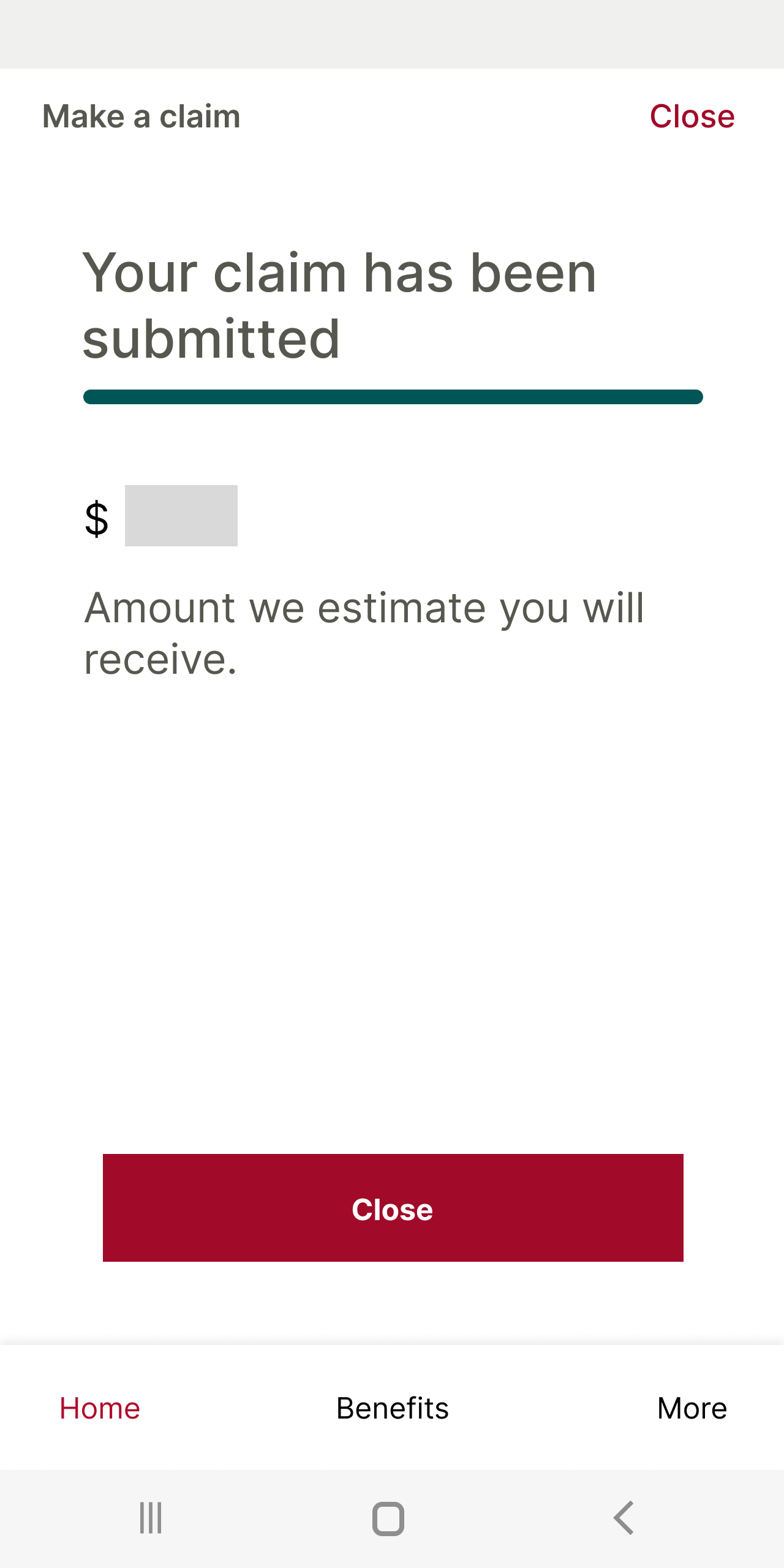
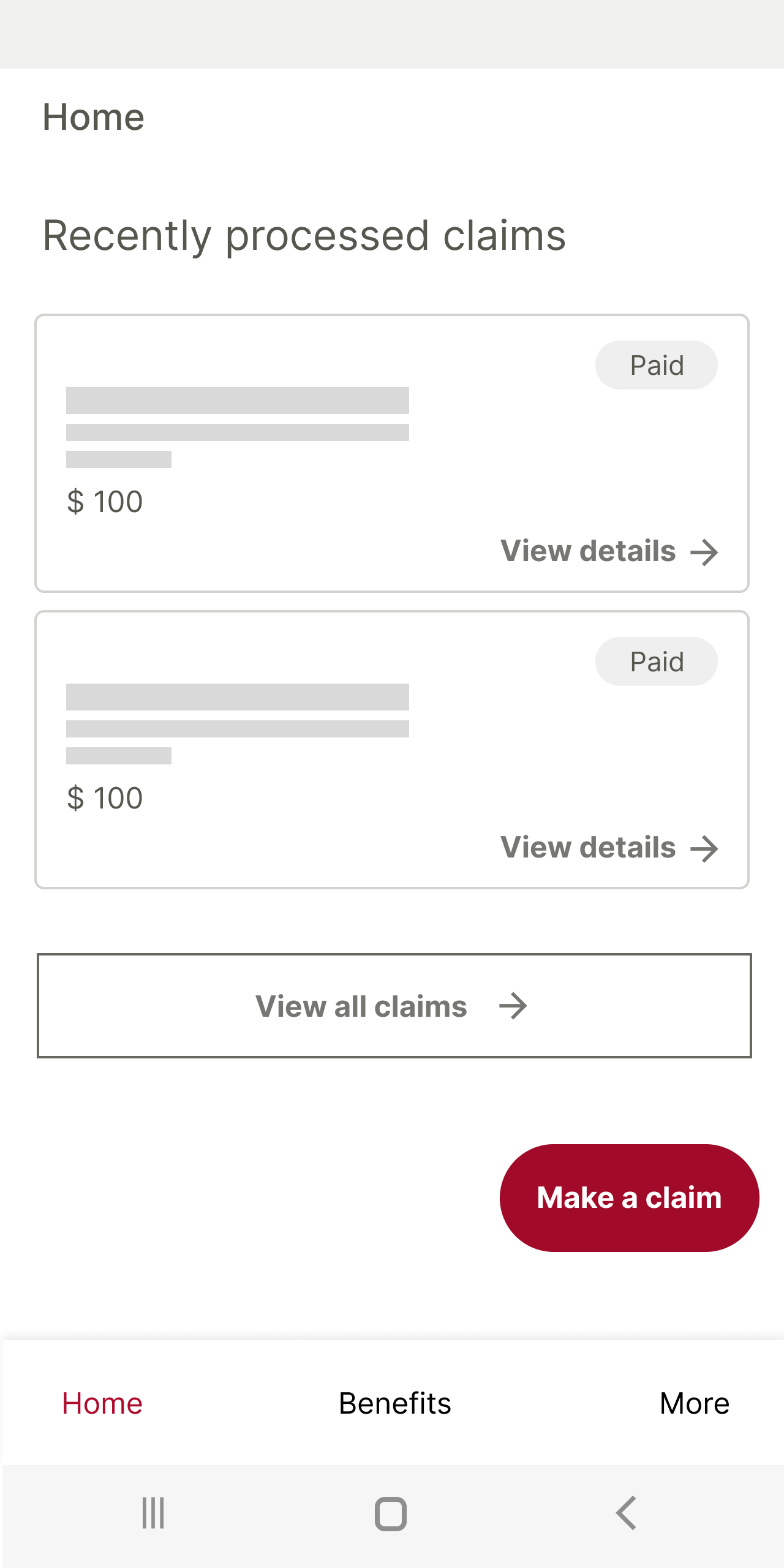
I removed the duplicated steps and redesigned the progress bar so it accurately reflects the actual steps of the claims process. I also suggested making the most recent processed claim clickable directly from the homepage, so users don’t have to dig through menus just to find what they need.
However, testing showed that users still felt the process was still too long to complete.

User flow example
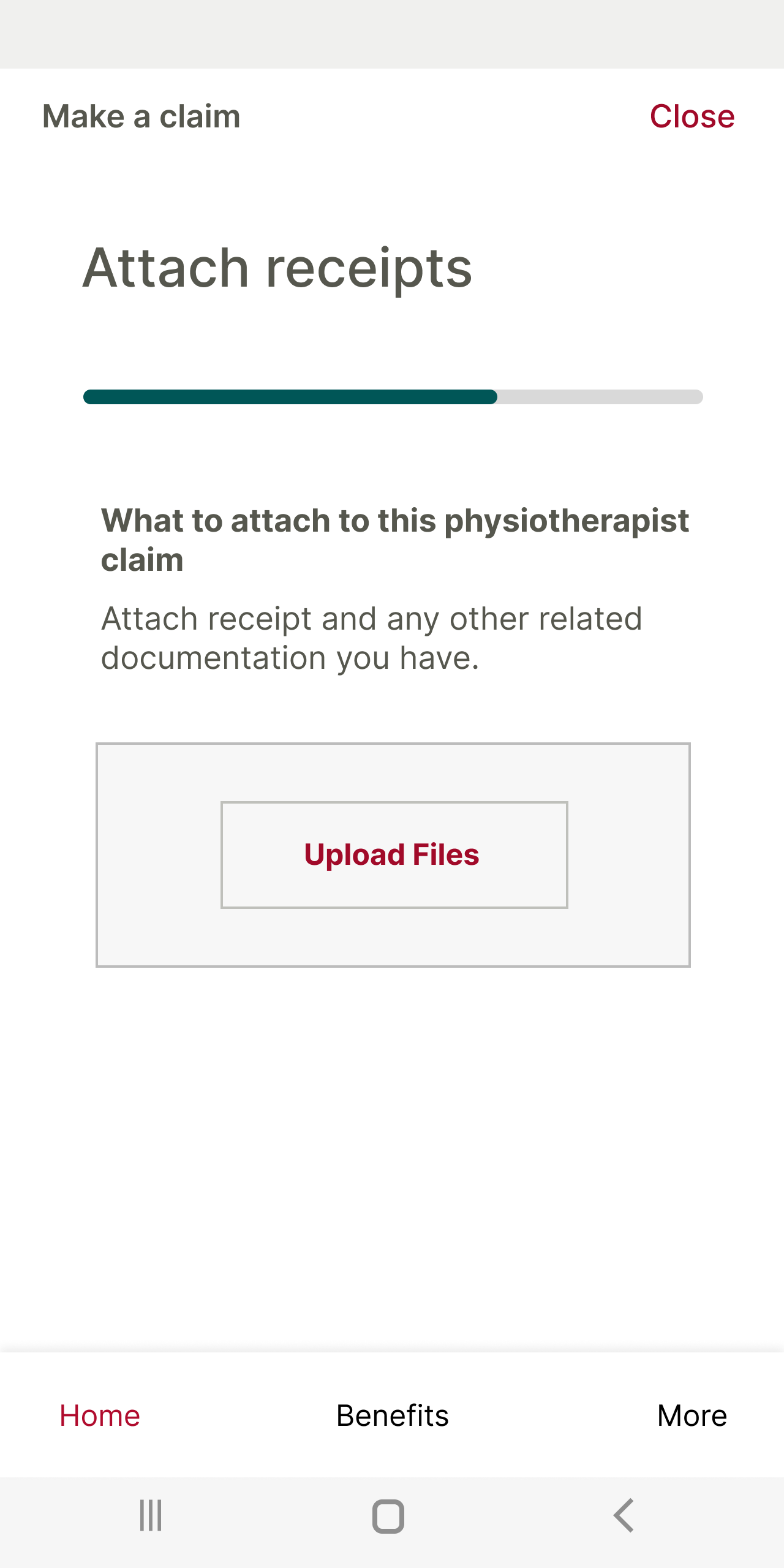
The final iteration
I restructured the claims flow to reduce cognitive load and make it feel faster—the provider receipt can be uploaded at the very start of the process, and the app pre-fills the claim using that information—after all, everything it needs is already there.